Engagement Boosters #2: Engagement as a Conversion Funnel
When I shipped the share-image feature, it felt like "the engagement" feature. Every post got a 1080×1080 card, a designed and branded image my readers could share with their friends/community, thereby improving the visibility of the site. I quickly realized that I had a lot more to do beyond image sharing.
Engagement on a publishing site isn't a feature you build once. It's a funnel you wire up stage by stage: get the work seen, measure what lands, convert the curious, keep the committed, and eventually feed engagement back into the experience itself. Every piece I've built since the share image targets one specific stage of that funnel. None of them works alone. This is the map.
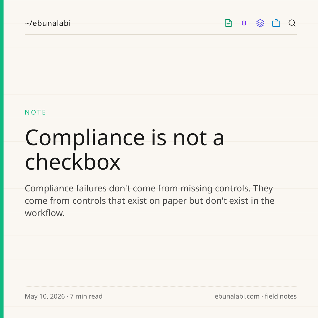
The 1080×1080 share card every published post renders into. Designed once, dropped into any DM, story, or group chat.
Reach: make the link carry the image
A share image is close to useless if it only lives inside the share dialog. The person sharing sees it; nobody else does. The real unlock came from a small, almost invisible change: making each post's preview image "the picture a platform shows when you paste a link" the same rendered card.
Now a link dropped into LinkedIn, iMessage, or Slack unfurls into the branded card automatically. The person sharing doesn't have to do anything extra; the image rides along with the URL. A bug that kept coming up was that, when the receiving platform tries to load the preview it sometimes would time out and fail to load. Making image formatting smaller, processed and saved at publish time fixed this so that the preview isn't generating the image at share-time.
Getting there taught a sharper lesson about share features in general: you cannot bet on a single mechanism. Link previews are best-effort, and "best" varies wildly by platform. iMessage and LinkedIn render them well. Slack renders them. Instagram's DMs don't render them at all, and Stories need an actual image file, not a link. There is no single code path that works everywhere.
So the share dialog refuses to guess. It exposes every path to share the link, share the image as an attached file, download the image outright or let the destination decide which one fits. When a capability has uneven support across platforms, the honest design surfaces the options instead of hiding a heuristic that will be wrong a third of the time.
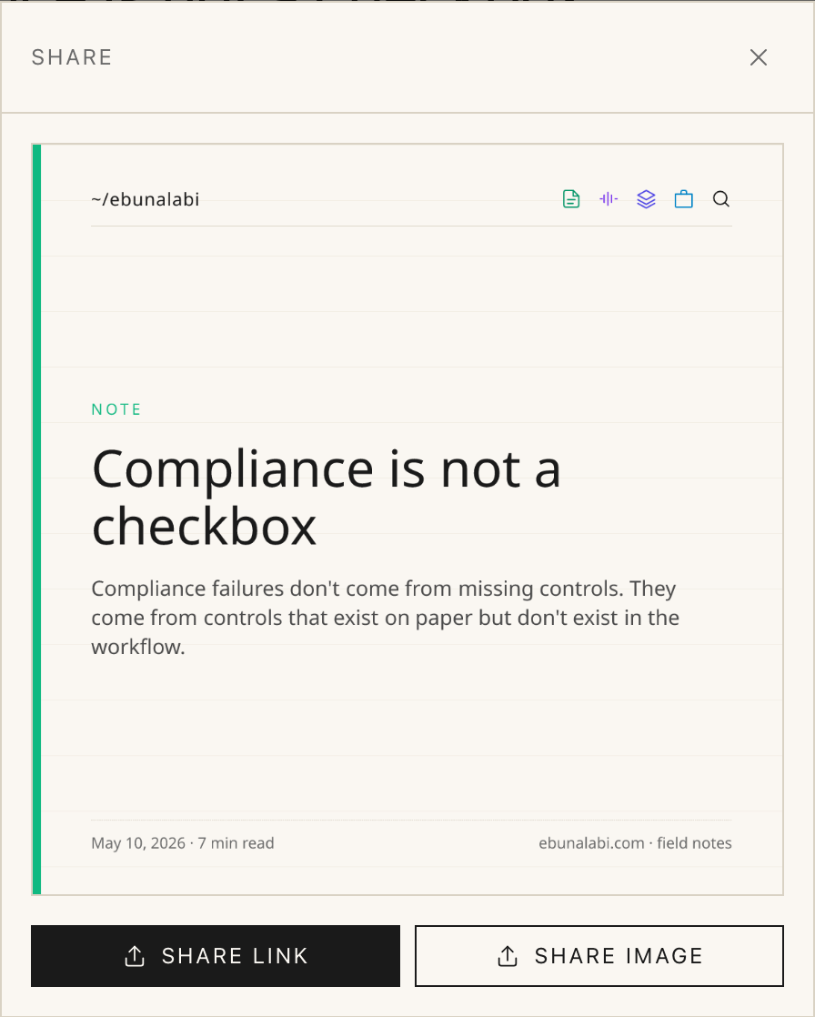
The dialog: same surface, multiple explicit paths. Each platform gets the one it actually handles.
Measurement: log the most decomposed event you can
You cannot boost what you cannot see. Before any optimisation, engagement had to become visible, so every interaction is now logged as one of five distinct event types: the share dialog opened, a native share completed, the image downloaded, the link copied, and an inbound click from a shared link.
The tempting shortcut is a single "shares" counter. One number, easy to read. But a single total hides the only genuinely interesting question: where are people dropping off? If dialog opens are high and completions are low, the dialog itself has a problem; too many choices, a slow image, a confusing layout. If completions are high but inbound clicks are low, the receiving platforms are swallowing the link and the share is going nowhere. Those are completely different problems with completely different fixes, and a rolled-up counter makes both invisible.
Tracking the intent event, the dialog opening; separately from the completion events is what makes it possible to compute a conversion rate. That rate is the number a product person actually wants: not "how many shares" but "of the people who tried to share, how many succeeded."
The underlying principle: granular events are cheap to log and impossible to recover after the fact. You can always roll detailed events up into a summary at read time. You can never decompose a summary back into detail. So log the most decomposed event you can afford, and aggregate later.
A quieter signal: counting plays
Shares and reads are loud signals meaning someone took a visible action. Audio needed a quieter one. Now a play is logged the first time someone starts a clip, and the count sits as a small, unobtrusive number next to the share icon.
It answers a question a download count cannot: did people actually listen, or did they just save the file for a "later" that never comes? For a creator deciding whether audio is worth the production effort, that distinction is the whole decision. Other metrics such as avg listen time, drop off point etc are other metrics I could add to better understand my listeners behaviour.
A play counted as a tiny number next to the share icon is the quietest engagement signal on the site.
Conversion: meet cold traffic at the deciding moment
Most visitors arrive cold. They followed a shared link, they have no prior context, and they decide within seconds whether this place is for them. Two pieces of the funnel target that exact moment.
The first is the welcome modal: a single card that appears just over a second after the page paints; long enough that it reads as a gentle nudge rather than an ambush. It carries three things: the brand mark, a one-line description of what the site is, and an inline subscribe form. No tour, no multi-step onboarding.
The reasoning is blunt: about pages are read by approximately nobody. The small fraction of visitors who genuinely care will go find it. Everyone else needs the elevator pitch surfaced at the precise moment they are deciding whether to invest more attention.
The second piece is zero-friction subscription. One submit. No confirmation email, no "check your inbox to verify." The visitor sees "you're on the list" immediately and the modal closes itself.
This deliberately breaks a "best practice." Double opt-in "the confirm-by-email step" is what every email guide recommends. But that recommendation answers a specific threat model: a high-traffic site where bots stuff subscriber lists, where deliverability reputation is fragile and expensive, where one bad address has real cost. None of that describes a personal field-notes blog with low send volume and an audience that mostly hears about it from the author directly.
For a low-volume solo product, double opt-in is a friction tax levied against a threat that does not exist. Every extra click is a place a willing subscriber quietly leaves.
The welcome modal: brand mark, one-line description, inline subscribe which is surfaced about 1.2 seconds after the page paints.
Retention: close the loop, and measure the loop
A subscriber is only worth something if you can reach them again. The digest system is the retention engine. It lets me compose a newsletter directly, or have a model draft; a theme-and-context summary of the past week's posts as a starting point, preview the result inline, and send it to the confirmed list.
The part that matters most is not the sending; it's the measuring. Delivery webhooks update a per-recipient record for every email with delivered, opened, and clicked events, so each digest reports its own open rate and click rate. The retention loop is not "send an email." It is "send an email and know whether it worked"; because the only way the next digest is better than the last one is if the last one told you something.
Turning the funnel inside out
The most recent layer does something different: it makes engagement data itself part of the draw.
The landing page now opens with a short series of auto-generated slides, computed live from the database; the total body of work, the tags I return to most often, the accumulated hours of audio, the posting rhythm over recent weeks, the pieces that resonated most. The corpus describing itself.
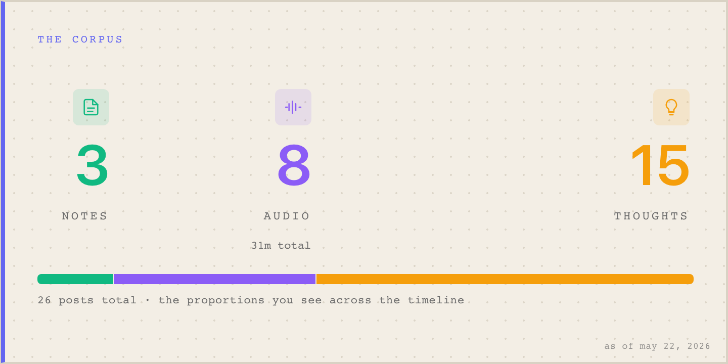
The "Corpus" slide: the body of work describing itself.
The pattern
Engagement is a funnel, and every booster has to know which stage it serves. A share image with no link preview is reach that doesn't reach. Analytics with no granularity is measurement you cannot act on. A subscribe form behind a confirmation wall is conversion with a deliberate leak. A newsletter you cannot measure is retention you are flying blind through.
The mistake is to treat "engagement" as one feature with one big checkbox. It is a chain, and a chain is exactly as strong as the stage you forgot to build.
Build the funnel, not the feature.